Daniel Joseph
Recent graduate(May 2021) from the University of Maryland-Baltimore County. B.A. in Environmental Studies with a Minor in Emergency Health Services and a GIScience Certificate. This portfolio includes projects completed using ArcGIS, QGIS, ENVI, and R. View My LinkedIn Profile
Description
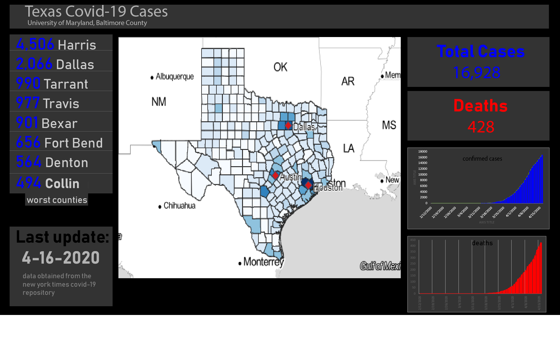
This project focuses on COVID-19 data at the county-level in Texas. An interactive map and a time series heat map GIF was created from my analysis. Data was obtained from the New York Times COVID-19 and all maps were created in QGIS. My final project will combine the interactive map with different plots to make a COVID-19 dashboard for Texas.
Data
The Texas county boundaries shapefile was obtained from the Texas Department of Transportation website . COVID-19 data was obtained from the New York Times ongoing repository of data on coronavirus cases and deaths in the United States. Since it was a raw CSV of all U.S. county-level data, I had to import the NYT data into R to properly filter. You can look at my process in Rstudio here to see how I subsetted the data to show only Texas counties.
*COVID-19 Data Last Updated: 4-16-2020
Analysis
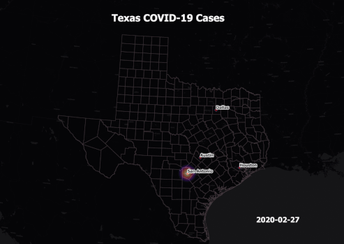
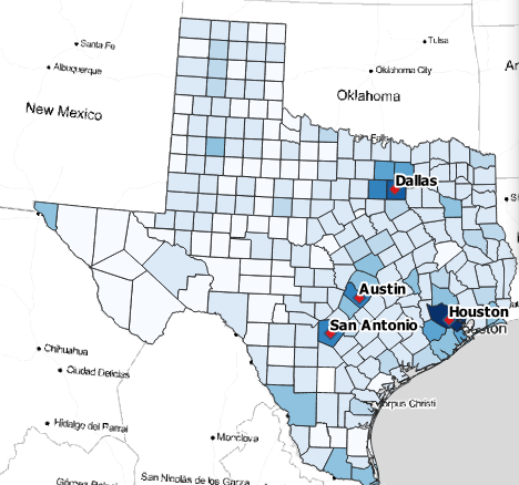
Once the CSV was filtered, I brought it into QGIS and did a table join with the Texas county layer based off of the FIPS county code. To symbolize the data, I used 8 graduated classes with custom ranges and blue for the color ramp. The four major cities were labeled since that is where the majority of cases are located. Stamen Toner Lite was used as the basemap. To create the web map, I used the qgis2web plugin with the OpenLayers library. Since Github has a 25 MB limit, I had to set the precision of the map to 9 so the file size would decrease. The time series heat map of confirmed cases was made in QGIS by using the layer styling panel. I set the radius to 8.6 and opacity to 45%. The data is shown in one week increments and Carto Dark was used as the basemap.
Outputs
Texas COVID-19 Interactive Map
[Texas COVID-19 Dashboard]
COVID-19 Confirmed Cases GIF (2-27 to 4-16)